Upping the game.
⨉ilica wanted to move beyond their previous generic look-and-feel design language and create a line of DSP and interface products that convey dependability, poise, trustworthiness, refinement, and a “premium feel”. The brand direction, and ideal buyer for ⨉ilica, focused on reaching IT users rather than A/V installers. That meant that the design direction for ⨉ilica needed to move away from a traditional audio component feel to more of a technical, "consumer electronic device" aesthetic. With that in mind, we created an industrial design solution that is competitive with the top players in the market and helps eliminate doubts about ⨉ilica's capabilities, commitment to quality, and attention to detail. Creating a clean, geometric, and minimal design language helps bring the ⨉ilica line up to date and be competitive within its market space. Most importantly, it connects with the IT users that ⨉ilica is looking for.
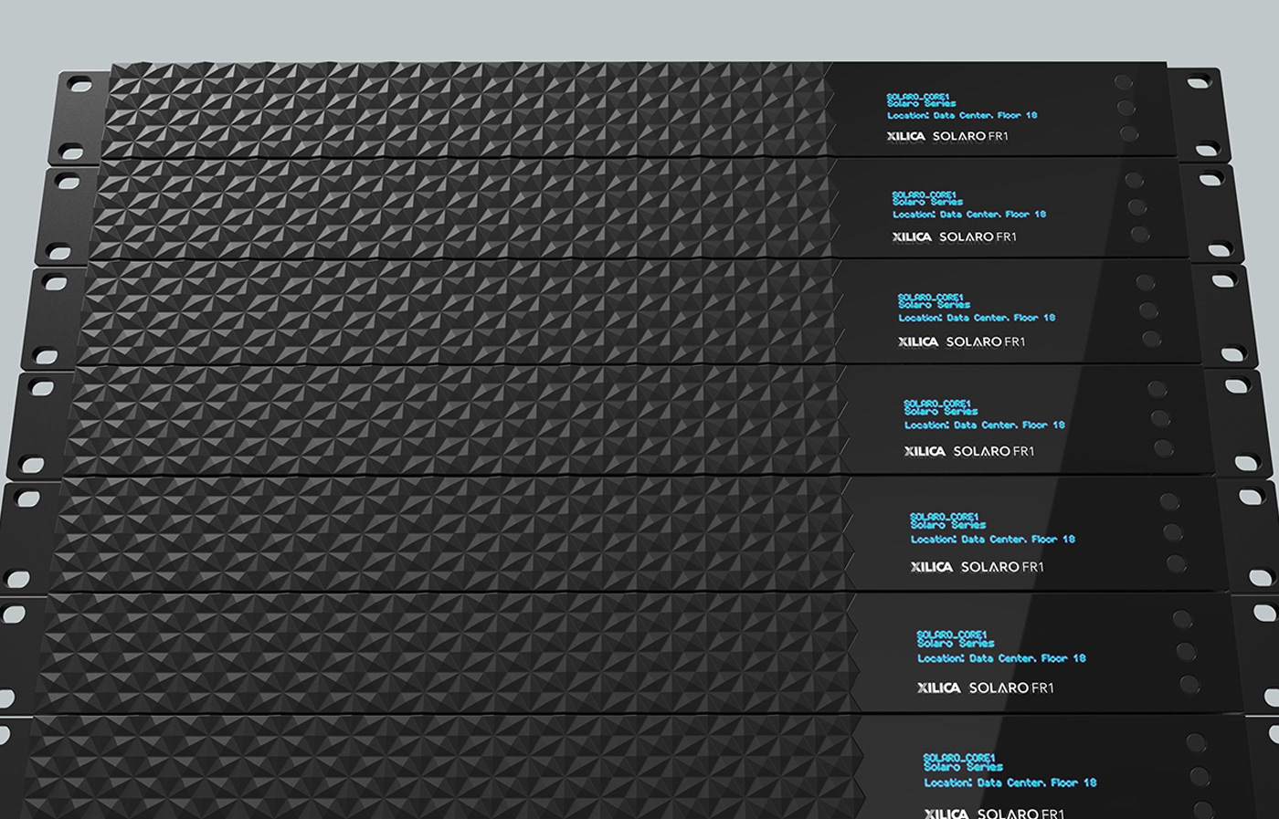
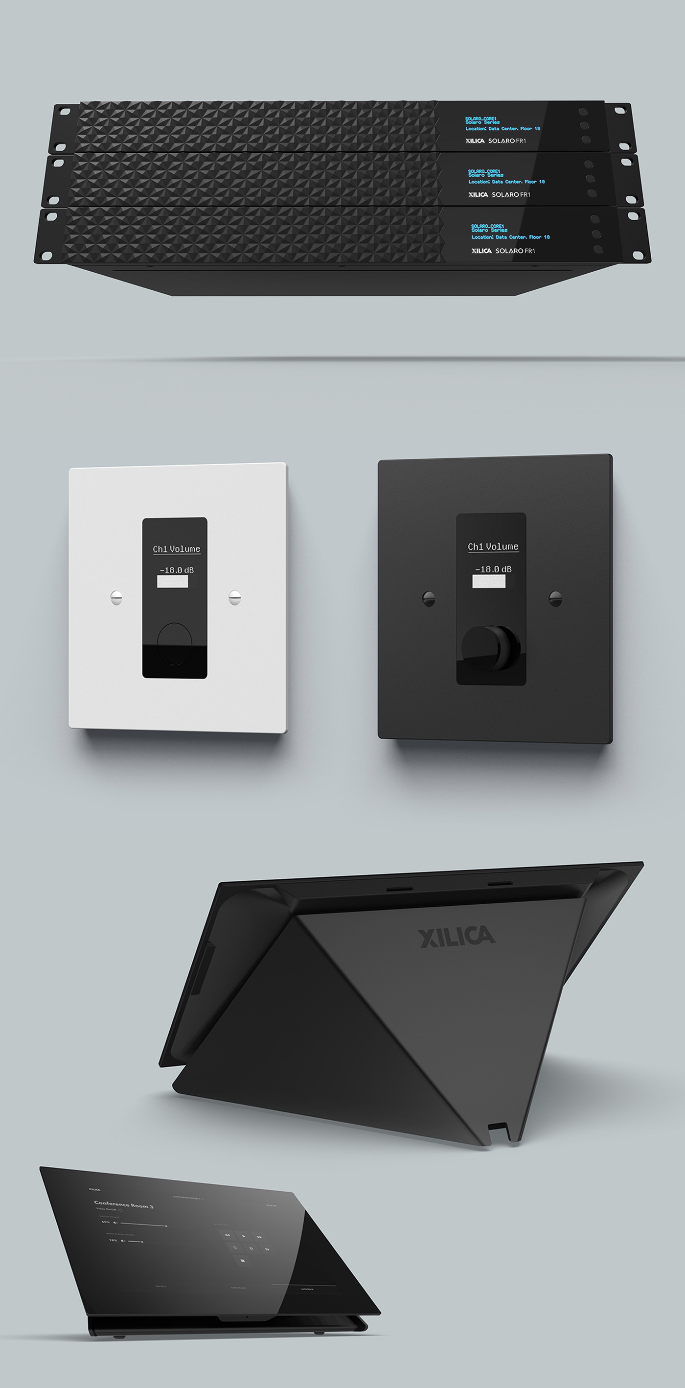
A minimal aesthetic meant that we had to play with textures to pull feature areas out from the overall enclosure design. All display areas are gloss black, while all secondary enclosure areas are textured black. The modified hexagon pattern on the FR1 rack mounted device adds interest to a product that would otherwise be a black box. The hex pattern adds a jewel-like detail, and conveys quality, that will catch a potential customers eye and convince them to investigate ⨉ilica’s products further. We designed a “Dead Front”, black panel feature on the front enclosures of all products with a display to convey a sleek, silent, and minimal appearance when the devices are off and a functional and clear aesthetic when the units are operating.
Services for ⨉ilica:
Art Direction
Industrial Design
Mechanical Engineering
User Experience / User Interface
Color, Materials, & Finish Development